inTime+
Service Design
Project intended to make families vacations to amusement parks easy and fun.
Duration: 3 weeks
Completion: August, 2023


My role
UX/UI Designer
-
Ideation
-
Research
-
Design
-
Prototyping
-
Testing

Proposal
and Objective
inTime+ is an application designed to facilitate the purchase of theme and amusement parks tickets.
To make a product that is user friendly, efficient, light and that can improve user's journey was the main goal.

Research
Secondary research provided me some relevant information over amusement parks and its users. There are some interesting statistics I`d like to share to enlight the importance of this project:
Statistics
$ 16.87 billion
Is the amount of U.S. dollars that expresses the market size the of theme parks sector in the U.S. alone.
Almost 60% of americans like amusement parks

Women and Millenials lead in the amusement parks popularity

Persona

Eve
Age: 31
Education: Business Major
Hometown: Augusta, Maine
Family: Husband
Occupation: Florist and Housewife
_ed.jpg)
Bio
Eve is an amateur florist who loves her plants. However, if there is one thing she love more than that is to spend time with her husband. She’s a theme park enthusiast and means to bring him with her in the next trip to Florida.
User Story
"As a loving housewife, I want to plan my family vacation and buy tickets for theme and amusement parks via my cellphone so that I can spend more time with my husband."
Goals
-
Needs to plan a vacation time that includes visiting parks.
-
Needs knowledge about distance, price and opinions concerning parks.
-
Needs to pay for tickets in advance.
Frustrations
-
Feeling insecure about wether there will be tickets available for her and her husband when they arive.
-
Needing to bring cash everytime they want to visit the parks.
-
Not having much time to look for different theme park options.

Brainstorming
This phase was interesting since I proposed myself to do it under pressure. When it comes to names some that came into my mind were ParkApp+, ParkOS, AmUS, Onhand, inTime+ and yourturn.
Taking advantage of the brainstorming session, I engaged in a Crazy Eights exercise that yielded some good design ideas for this app. You can check it out below.
User Flow

I drafted the intended user flow below, containing the expected various tasks they can perform to schedule an amusement park visit.


Wireframes
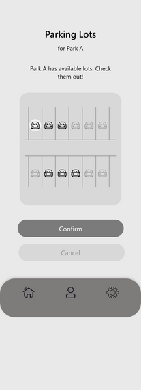
Considering the information I had so far I created Wireframes to put the ideas into motion and engange testing later. You will find some examples below.

Usability Test
With Wireframes ready, I proceeded to testing the user flow via an Unmoderated Usability Study. Here's what I found out along with other information.
KPIs
-
Conversion rates.
-
User error rates.
-
Drop-off rates.
-
System Usability Scale.
Research Questions
-
Are users able to successfully finish buying tickets?
-
Are ther eany parts of the design that interrupt the user flow?
-
Are there motives for users to drop the task completely?
Research Goals
-
Understand if the design is clear, clean and equitable.
-
Figure out if the app can effectively help people book park visits.
Participants
-
People from 21 to 54 years old.
-
3 Men and 3 Women.
-
High School degree to College degree range.
Sessions
Length: 10-15 minutes.
Location: Remote.
Task: Users were asked to buy a ticket.
Themes
Based on the results of the usability test, some themes can be pointed out:
People finished the task with ease
People would use such an app to their needs
People really enjoyed the user flow
6 out of 6 total participants finished the task. 5 out of 6 with no difficulty whatsoever
6 out of 6 total participants stated that they would use an app like the one proposed
5 out of 6 total participants gave this app 5 stars in a scale that go from 1 to 5.

Visual Library
The visual and design patterns I used to protoype can be summed up in this way.
01
Colors
Primary
Secondary
02
Typography
Base
Manrope - 28 px
Manrope - 20 px
Manrope - 18 px

The Final Product
This is the prototype that came out of this edeavor. You can see some screens below and the prototype itself to try it out, so, be my guest!


Analysis
We're almost done! However, there are some inferences that I can point out after all is said and done.
What I've learned
To improve the overall presentation of design.
The user's feedback is quite crucial. That's not a joke!
I haven't failed 139 times.
I just found out 139 ways a design won't work.
Areas of improvement
Implementation of other screens like settings screen, profile screen and cart screen.
Insertion of a payment confirmation page before the end screen.
Perform another usability test to acertain the correct reception of the design.


